Utilization Metric Analysis
What is driving overall rates of hospitalization and ED utilization that may be reduced with effective care management?
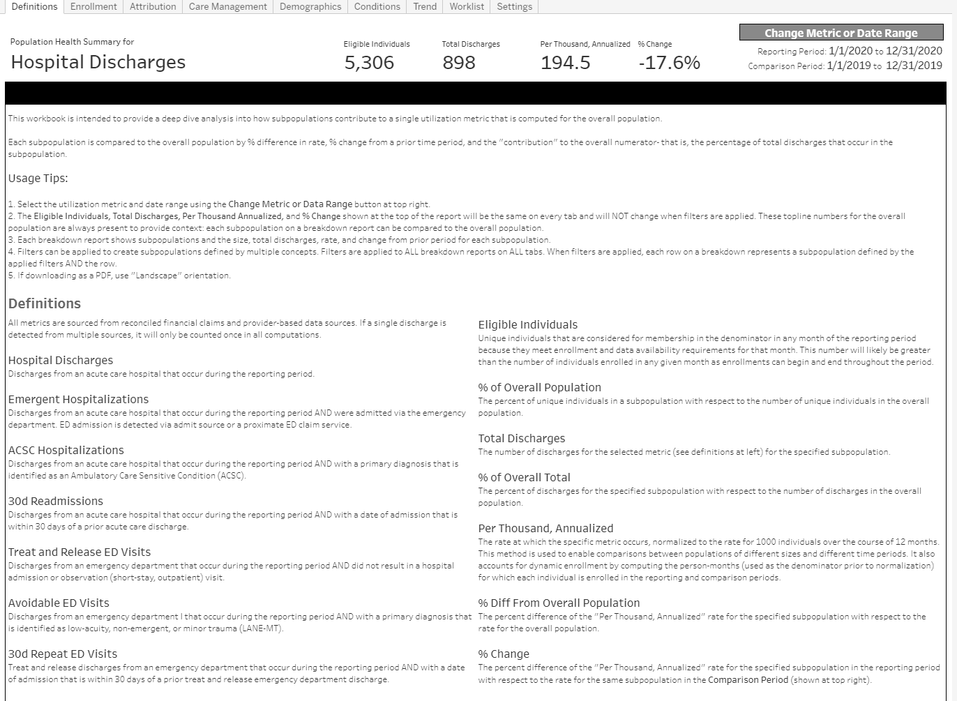
This analysis is driven by an understanding that multiple metrics and population averages can obscure critical patterns in a population. The reports focus on a single metric (configurable) and emphasizes how subpopulations vary with respect to that metric.
To compare subpopulations and prior periods, all metrics are expressed as a comparable rate: annualized rate per 1000 persons. This approach enables population comparisons irrespective of population size, time period, or enrollment dynamics (as individuals enter or leave a population during the reporting period). Rate variation in subpopulations can suggest management opportunities (for high rates) or positive deviants (for low rates) that can be mined for best practices.
Subpopulations can be visualized using report filters or breakdown reports. Subpopulations can be defined by features such as: enrollment, attribution, geography, demographics, disease registry or recent utilization.
For any subpopulation, the utilization metric (expressed as a comparable rate: annualized per 1000 persons) is shown by: difference from the rate of the overall population, change from a prior time period, and contribution to the rate of the full population (a very small subpopulation with a very high rate will likely make a small contribution to the overall population rate).
These reports are created as interactive dashboards but are formatted to enable “print to pdf” for easy distribution. Any subpopulation can be readily turned into a list of individuals that can serve as a worklist.
Supported Metrics
- All Hospitalizations
- ACSC Hospitalizations
- Emergent Hospitalizations (admission via the ED)
- All-cause readmissions (30 day)
- Treat and Release ED Visits
- Avoidable ED Visits
- Repeat ED Visits (30 day)
Key Questions of Interest
- What subpopulations (specified by attributed provider, enrollment, geography, demographics, chronic conditions, etc.) are driving the specified utilization metric by accounting for a large subpopulation, a higher rate, a large increase over time, or a combination of these factors?
- How does is this metric trend over time and does the trend vary between subpopulation?
- Do recently enrolled individuals have a different rate?
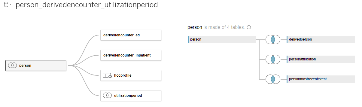
Bulk Data API Requirements
Dashboards that address these key questions can leverage the following tables within the Bulk Data API data model:
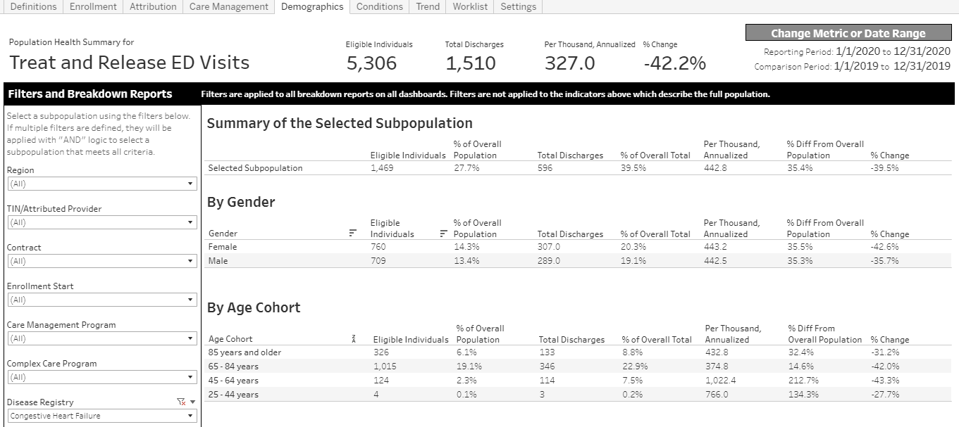
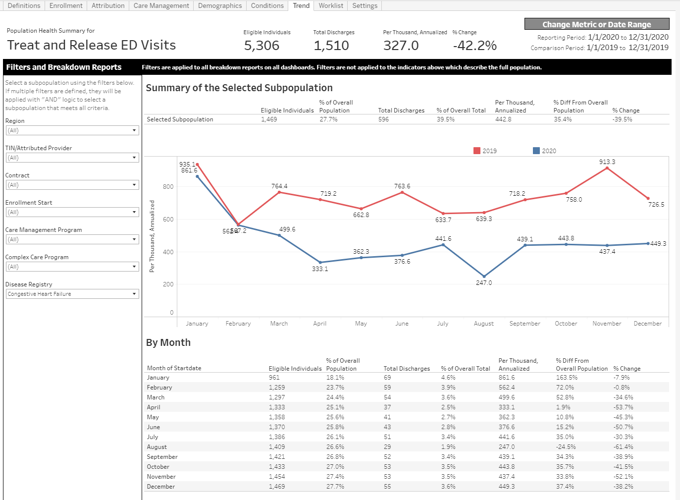
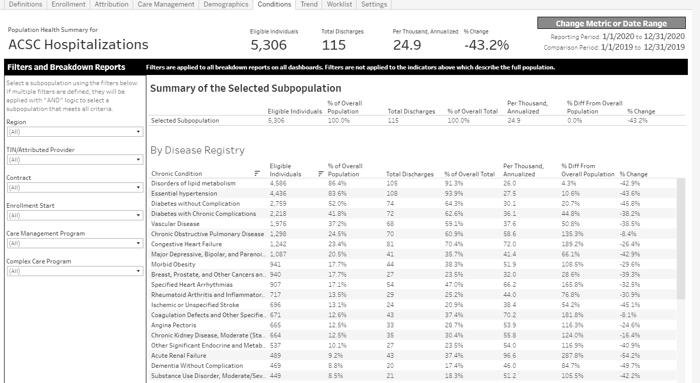
Example Visualizations (Tableau)
You can view and download this example report on analytics.careevolution.com: Utilization Metric Analysis
This Tableau workbook uses the following data source configuration: